In 2017, when Jim Lenahan ended his run as USA Today’s Music Editor, the podcast he and Patrick Foster co-hosted, Dad Rock, came to an end as well. When the guys made the decision to launch a new podcast, Rockin’ The Suburbs, they wanted to focus on similar sounds but needed a different look to make it clear this wasn’t just the B-side of Face the Music. Among the requirements for the logo:
- Avoid the color scheme of the Dad Rock design, meaning avoiding the use of red and yellow.
- Convey a sort of retro vibe, but don’t mimic the Illustrator-style cassette tape icon on the original.
- Include the names of both Jim and Patrick, so listeners knew these were the music hosts they’d come to know and love.
- Include the name of the podcast (duh).
Here are the solutions I came up with. All were created using a combination of Adobe Illustration and Photoshop.
Trying to avoid the cassette tape of the Dad Rock Show logo, I went one media generation back and focused on an 8-track jammed into a car stereo. Also, wanted to be more graphic and bold than the previous logo (it’s ROCKin’ the Suburbs after all, not Gently Nudging the Suburbs), I chose an orange-and-black color scheme, which I stuck with until the end.
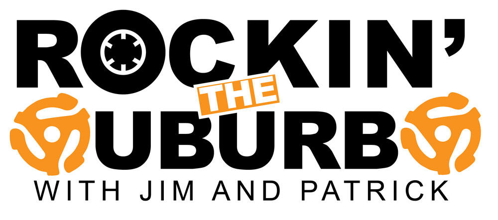
Wanting to stick with the outdated music technology theme, I decided to replace the S’s in “Suburbs” with those 45 record adapters (also called “record inserts” or “spindle adapters,” in case you were wondering). Then, just to echo back to the cassette images in the original logo, I replaced the O in “Rockin'” with the reel from a cassette. A pretty decent shot, I think, and I like the strong horizontal feel, but ultimately, it’s a case of too much going on — and those adapters not quite looking enough like S’s.
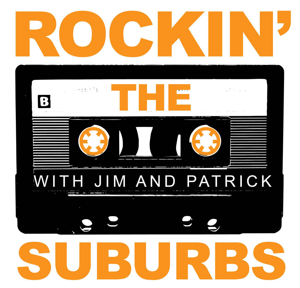
I also tried a more rough, downer-and-dirtier spin on the original logo, with the orange-and-black color scheme and a high-contrast image of a vintage cassette tape. Not bad, and I especially like how the reels (created in Illustrator) contrast so strongly with the grittiness of the photo, but ultimately, too close to the Dad Rock logo.

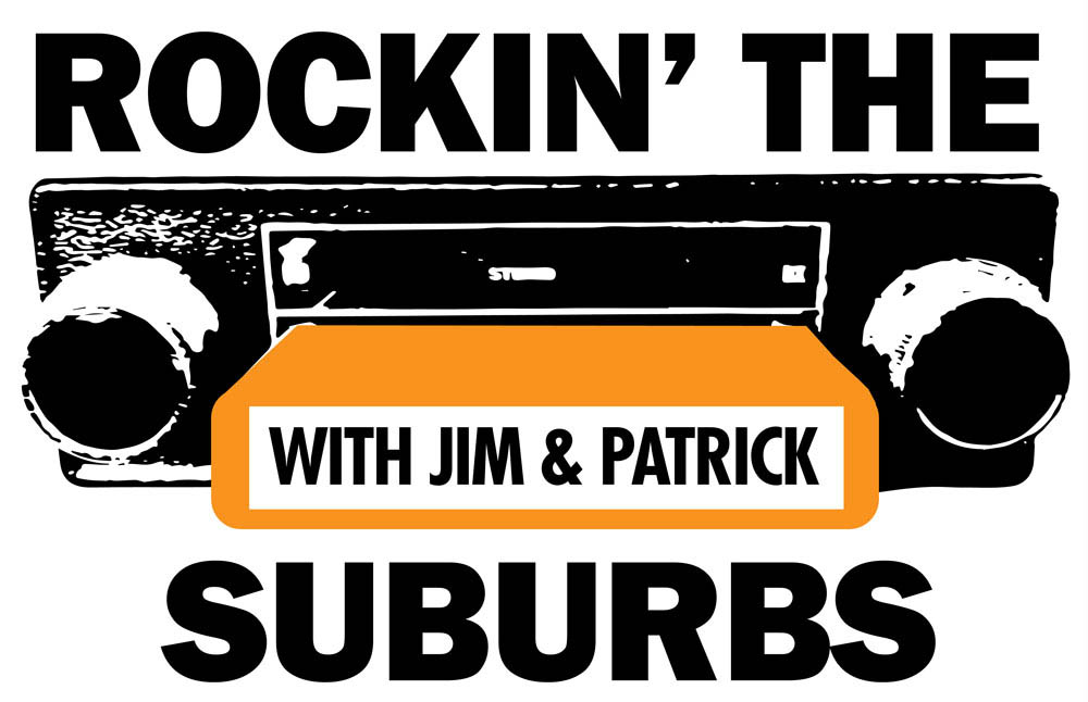
Still partial to some sort of theme using cassette tapes (it’s the format I grew up with, for the most part), I stumbled onto using the image of a boombox as the focus point. Blowing out the contrast as much as possible and fixing up any loose bits in Photoshop, I built the logo around it and snuck Jim and Patrick’s initials into the space the old JVC logo once stood. Best thing about this design? It gave me a logical place to put the “THE” — that three-letter word in the middle of the podcast title was really starting to annoy me, layout-wise.